

Key takeaways
- Bring the metrics you use to make one operating decision into one visual workspace.
- Build for one audience and one question, not every possible reader or report.
- Keep five to 10 actionable KPIs, with targets, benchmarks, and a next step.
A useful marketing dashboard does more than display clinic activity. It helps you see where the path from inquiry to repeat booking needs attention, who owns the relevant number, and what response the team has agreed to make.
What is a marketing dashboard?
A marketing dashboard brings metrics from several sources into one visual workspace. Instead of moving among channel reports and spreadsheets, you can see performance across channels in one place. The dashboard can also put current results beside past trends, so a change has context.
That definition matters because a dashboard is not just a polished report. A report can show what happened. A useful dashboard is arranged around a decision you need to make. It gives the intended reader enough detail to understand the result and act, without making them sort through every available metric.
The value of a shared view is practical. Marketing dashboards can replace scattered tools and spreadsheets with a single real-time view of channel performance. Your dashboard still needs a clear audience and trusted definitions, but the screen becomes the common place where the team reads the numbers. That is the foundation of a useful digital marketing dashboard.
A med-spa view follows the revenue funnel
For a clinic, the most useful organizing view is the revenue funnel from first inquiry through repeat booking. It follows the business path that matters to an operator, instead of separating each marketing channel into its own reporting silo.
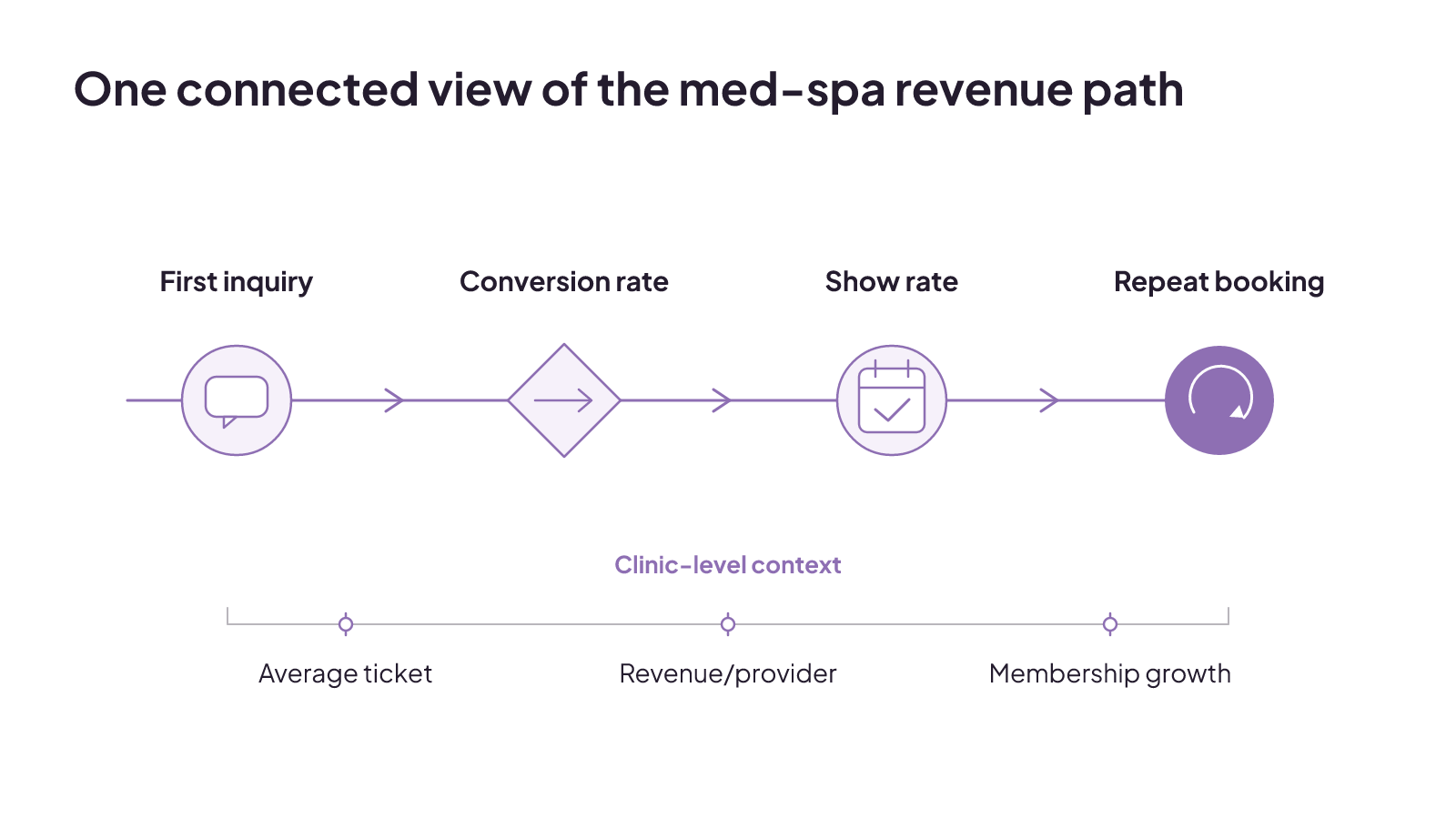
A customized med-spa dashboard can put the practice's main metrics on one screen. Relevant KPIs include new leads, conversion rate, show rate, average ticket, revenue per provider, and membership growth. Together, those measures can cover several points in the clinic's revenue funnel. Each one should still retain its own definition and owner.
Picture the operating view from left to right: first inquiries enter the funnel, conversion and show rate describe movement through later stages, and repeat booking closes the view. Average ticket, revenue per provider, and membership growth remain visible as clinic-level measures. This layout does not prove why a number changed. It gives the team a connected place to see which part of the funnel needs a closer look.
You can also link the dashboard's stages to a shared patient journey. That keeps the clinic's labels consistent as the view moves from discovery and inquiry toward booking and return activity.
Which dashboard type fits the decision?
The four main dashboard types are strategic, operational, analytical, and tactical. They serve different leadership needs and decision horizons, so the right type follows the team's decision workflow.
A strategic dashboard supports a high-level leadership view. An operational dashboard supports the work the team is managing now. An analytical dashboard gives room to examine data and patterns. A tactical dashboard supports a more focused area of execution. Those categories are useful starting points, but the intended reader should determine what earns space on the screen.
Executives generally need a high-level view of return on investment and revenue impact. Managers and specialists need more granular, filterable metrics for daily optimization. An owner may need to see the health of the full inquiry-to-booking path, while a marketing manager needs filters that expose a campaign or channel issue. Those views can use the same trusted data without using the same layout.
Tailor executive KPIs to each leader's responsibilities and strategic priorities. Name the dashboard's intended reader and operating question before you choose charts or software.
Use a decision worksheet before choosing software
A useful dashboard starts with one audience, one operating question, and one set of trusted definitions. A short decision brief also keeps the analysis proportional to the choice and makes assumptions visible before you commit money or time.
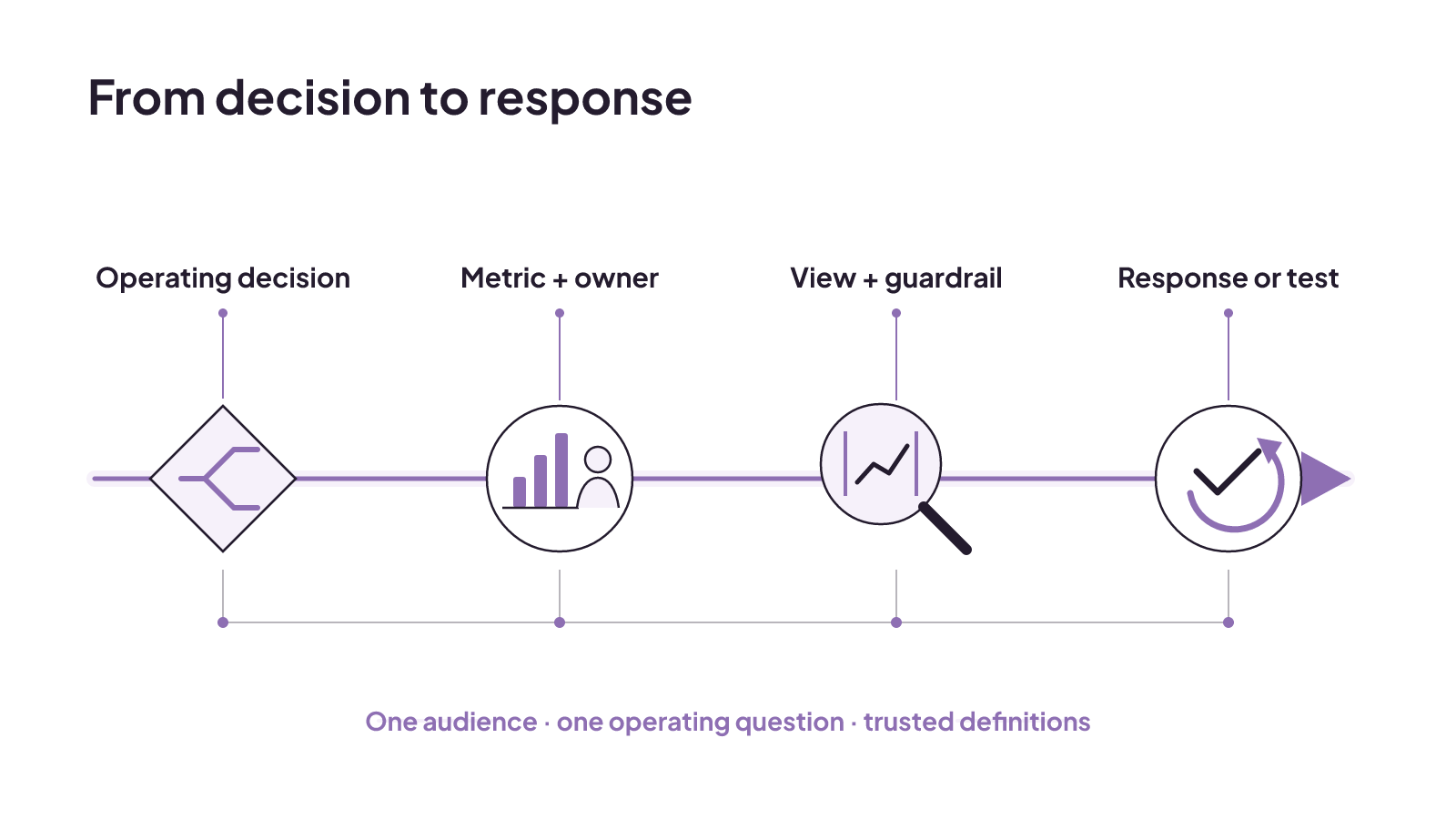
Use this five-row worksheet to scope the decisions your pilot must support. Fill each row with one recurring decision. Name the metric and its owner, the diagnostic view and guardrail, then the response or controlled test tied to that decision.
| Operating decision | Metric definition and owner | Segment or cohort, plus threshold or guardrail | Operational response or controlled test |
|---|---|---|---|
| Decision 1: ___ | Definition: _; owner: _ | View: _; threshold or guardrail: _ | Response or test: ___ |
| Decision 2: ___ | Definition: _; owner: _ | View: _; threshold or guardrail: _ | Response or test: ___ |
| Decision 3: ___ | Definition: _; owner: _ | View: _; threshold or guardrail: _ | Response or test: ___ |
| Decision 4: ___ | Definition: _; owner: _ | View: _; threshold or guardrail: _ | Response or test: ___ |
| Decision 5: ___ | Definition: _; owner: _ | View: _; threshold or guardrail: _ | Response or test: ___ |
The setup work behind these rows includes inventorying recurring decisions, mapping metric definitions and owners, auditing tracking and CRM connections, defining outcome and diagnostic hierarchies, and finding decision gaps. Segment and cohort views, thresholds, guardrails, decision rights, and controlled tests can then be set against those decisions. This makes each KPI decision-linked: when performance changes, the row already connects that change to an operational response.
How do you build a marketing dashboard?
Build the marketing dashboard in four steps: define the audience, select the relevant metrics, connect the data sources, and design the view for clarity and action. That order keeps the software from dictating the decision.
First, name the person who will use the dashboard and the question they need answered. Then select only the metrics relevant to that question. Connect the sources needed to produce those metrics, and arrange the result so the reader can find the decision signal quickly.
If the view includes advertising, structure each ad campaign toward a clear goal. The campaign goal gives the ad view a defined purpose. It can then sit within the larger clinic funnel without turning the dashboard into a gallery of channel activity.
The worksheet and the build sequence work together. The worksheet defines the decisions and ownership. The build turns those definitions into a working view.
Shared definitions make the charts usable
The charts become dependable only when the inputs use consistent definitions. A funnel dashboard may draw from four data-source categories: ad platforms, web analytics, marketing automation, and CRM data. Those feeds need a unified schema, consistent campaign tags such as UTM tags, and consistent lead-lifecycle definitions.
Governance belongs in the build as well. The team needs rules for handling duplicate leads, logic for attribution windows, and validation of deal-stage progression. Without those controls, two charts can use the same label while counting different things.
This is where a metric owner earns their place in the worksheet. Ownership keeps the definition, source connection, and operating use tied together. The shared schema lets the executive and operational views read the same underlying stage. The separate layouts can then serve their readers without creating separate versions of the truth.
For a focused example of one input, our guide to digital marketing call tracking follows a med-spa lead from source to booking.
Where is the funnel actually breaking?
Aggregate results can hide the stage where prospective patients drop out. A funnel dashboard makes the stages visible and tracks conversion rates between adjacent stages. Those stage-to-stage rates help pinpoint bottlenecks.
For a med spa, place the relevant funnel stages in order, then show the volume at each stage and the conversion rate from one stage to the next. The first useful question is not whether the total looks good. It is where the largest change appears between adjacent stages.
Filters add the diagnostic detail that an aggregate view lacks. Segment the results by campaign, channel, persona, and time cohort because conversion rates can vary by source. A clinic-wide number may look steady while a particular channel or cohort moves differently. The filtered view exposes that variation without changing the main funnel definition.
A stage conversion rate can show where the bottleneck appears. The segments can narrow the view by campaign, channel, persona, or time cohort. The operational response in the worksheet stays tied to the threshold or guardrail the team set for that decision.
Clear conversion tracking also gives the team a shared way to discuss movement between defined stages.
What does an executive funnel dashboard look like?
An executive funnel dashboard can open with a top-level view of stage volumes and conversion rates. Stages that exceed or miss a benchmark can be visually distinct, so leadership can see pipeline health without starting in campaign-level detail.
Below that funnel, a compact scorecard can show total pipeline, average sales-cycle length, cost per sales-qualified lead, and lead-to-customer conversion rate. Current, prior-period, and year-over-year values can provide comparison points. Weekly or monthly charts can then show volume and conversion trends, with a benchmark line where an industry comparison is appropriate.
The executive and operational layers have different jobs. The executive layer focuses on pipeline health. The operational layer focuses on tactical campaign fixes. A leader can see that a stage has missed a benchmark, while a manager can use the more detailed layer to filter the relevant campaign data.
This layout keeps both levels connected. Stage names, metric definitions, and source data remain consistent. What changes is the amount of detail presented to each reader. The executive gets the high-level view of the funnel, scorecards, and trends. The operating team gets the filters needed for its work.
Choose software for the data and team you have
Choose dashboard software by the reality of your clinic and reporting workflow. Platform fit depends on team size, data complexity, governance requirements, and team maturity. Marketing-reporting software should also be evaluated against organizational structure and analytical maturity.
Start with the sources named in your worksheet. Count how many connections the pilot needs, how complex the data is, who needs access, and who will govern definitions. Then consider whether the team can maintain the proposed view at its current level of analytical maturity. A platform built for a complex organization may add work that a smaller team does not need. A simpler setup still has to handle the data and governance the pilot requires.
Look beyond the advertised software price when you compare the commercial options. Total cost can include connector fees, user seats, data-row overages, professional services, training, business-intelligence licenses, and maintenance hours. Put those items beside the expected build and upkeep, not only the subscription line.
Software is the container for the workflow. The audience, decisions, definitions, and ownership still determine whether the dashboard is usable.
Keep the dashboard small enough to use
More metrics do not automatically create more insight. Effective analytics dashboards focus on no more than five to 15 KPIs, with clear benchmarks and interactive drill-down capabilities. A KPI dashboard has a tighter recommended range of five to 10 actionable KPIs, supported by targets, benchmarks, and next steps.
The two ranges describe different scopes. The broader analytics dashboard can support deeper examination. The focused KPI dashboard is built around a smaller set of measures that connect to action. Your five-row worksheet is a useful constraint because it starts with decisions, not an inventory of everything the software can display.
Dashboards used daily combine five traits: automated data pipelines, decision-linked KPIs, layouts built for rapid insight, segmentation filters, and alert systems. Each trait supports regular use, but none is a reason to crowd the screen.
Dashboards tend to fail when comprehensiveness replaces clarity, activity replaces outcomes, or technical sophistication replaces stakeholder needs. That is a strong test for every proposed addition. If a metric does not serve the audience's operating question or a defined next step, it should not take space from one that does.
Start with one complete funnel pilot
Start the pilot with one campaign, one channel, or one persona. Track that funnel from top to bottom, validate the data with stakeholders, and iterate. This keeps the first build attached to a complete operating question instead of spreading unfinished connections across the whole clinic.
The wider workflow should establish shared truth and connect analysis to decisions. Prove it on a small number of high-value questions before expanding the toolset. Your completed worksheet provides the scope: named decisions, definitions, owners, diagnostic views, guardrails, and responses.
At Ownerized, our focus is the connected pre-booking path across search, profiles, reviews, DMs, forms, and booking flows for med spas and aesthetic clinics in the United States and Canada. Our source-to-booking call-tracking guide follows a med-spa lead from source to booking. Complete the five worksheet rows, then choose one funnel to build first.

CRM system email marketing: how med spas should choose the right setup
The right CRM email setup matches data flow, handoffs, governance, reporting, and the implementation burden your clinic can carry.
Read insight
ROI tracking: calculate the return and label what the number proves
ROI tracking is credible when every cost is counted and each result is labeled as observed, attributed, or experimentally incremental.
Read insight
Healthcare social media marketing: choose channels, controls, and handoffs
Healthcare social channels fit different patient needs; use a question-risk-handoff matrix to set review, response, and contact ownership.
Read insight