
Key takeaways
- A lead generation landing page asks visitors to complete one defined action.
- The path continues after submission, when the thank-you state confirms what happens next.
- Measurement connects the completed action back to the campaign, so you can find the first break instead of judging the page by appearance alone.
What is a lead generation landing page?
A lead generation landing page is an individual website page built to prompt one defined action. When the page supports an ad campaign, it is where a person arrives after clicking that ad. It is more focused than a general website page because the intended action gives the page its job.
For a clinic campaign, that action might be a form submission. Other landing pages may ask visitors to subscribe, start a trial, or make a purchase. The page's conversion rate is the percentage of its visitors who complete the intended action. If 100 people visit and 10 complete it, the conversion rate is 10 percent.
That definition keeps the evaluation honest. A polished page isn't successful merely because it looks complete. You need to know whether the person who clicked can understand the offer, find the action, complete it, and receive a clear response afterward. That wider path is especially useful when you are reviewing med spa lead generation, because the form is only one point between interest and a possible booking.
Use the Landing Page Continuity Test
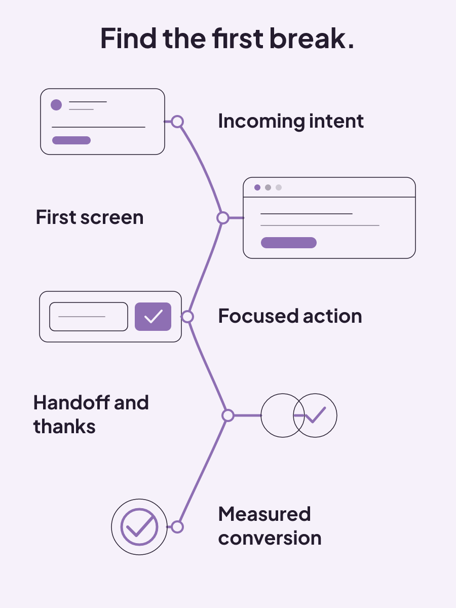
Score the whole path before discussing colors, fonts, or button shape. Mark a checkpoint as passing only when its required condition is visible in the live experience or operating setup. The first failed checkpoint gives the campaign, page, and follow-up owners a concrete problem to examine together.
Landing Page Continuity Test
| Checkpoint | Required condition | Diagnostic question |
|---|---|---|
| Incoming intent | The ad details match the intent behind the targeted keywords. | Does the campaign promise answer the reason this person searched? |
| First screen | The first screen repeats the incoming promise, adds relevant proof or details, and presents a next step. | Can a visitor see the promised benefit and what to do without searching the page? |
| Decision focus | The page stays centered on one conversion goal. | Is anything competing with the action the campaign was built to earn? |
| Form visibility | The form is easy to find and aligned with the visitor's intent. | Can the visitor find the form at the moment they are ready to act? |
| Action clarity | The call to action plainly tells the visitor what to do next. | Does the button describe the action instead of making the visitor guess? |
| Operating handoff | The page, message, routing, approval, and reporting support the same next decision. | After submission, does the request continue toward the action the page promised? |
| Thank-you state | The response confirms the action, sets expectations, and offers one clear secondary action. | Does the visitor know the submission worked and what happens now? |
| Measurement | The intended conversion can be recorded. Google Analytics conversions can be imported into Google Ads and used with its conversion measurement. | Can you distinguish a completed action from a visit or button click? |
Give the scorecard to the people who own the campaign, page, form, and follow-up. Their shared task is to find the first condition that fails. Teams reviewing response timing can use our speed-to-lead definition as a common term for that part of the handoff.
How do you create a lead generation landing page?
Create the page around the action already promised by the campaign. The ad's call to action and the page's call to action should connect closely. If the ad invites someone to request a consultation, the page should not open by asking them to browse unrelated information.
Lead with the benefit that matters to the visitor. A feature list describes what exists, but the headline and copy need to address why the reader would act. Keep the form path visible, reduce competing content, and use the layout and visuals to guide attention toward that action. Removing distractions also reduces the mental effort required to make the decision.
A simple first-screen working example could look like this:
Headline: Request a consultation for your skin goals
Supporting line: Tell us what you would like to discuss and choose the next step.
Primary action: Request a consultation
Form path: Visible beside or directly below the message
Navigation: No menu or unrelated content competing with the form
Use this shape only when it fits the campaign. Keep the benefit-led headline, form path, and call to action connected to the same visitor request. The exact words should reflect what the ad promised and what the form lets the visitor do.
One practical review is to place the ad and first-screen draft side by side. Read only the ad's call to action, the page headline, and the page button. Those three lines should describe one connected action. Then inspect the space around the form. A menu, a second offer, or excess copy can pull attention away from the form even when each item seems reasonable on its own.
Visuals also need a job. Use them to guide attention toward the message and form, not as decoration that creates another focal point. The first screen should let a visitor identify the relevant benefit, find supporting details or proof, and see the next step without working through unrelated choices.
What does a strong lead generation landing page example show?
A strong example makes the amount of work clear before the visitor begins. If the signup uses several steps, state the total number in the headline and label each step as the visitor moves through it.
For example:
Headline: Request a consultation in three steps
Step 1 of 3: Your details
Step 2 of 3: Your request
Step 3 of 3: Review and submit
The labels give the visitor a visible sense of progress. They also prevent a multi-step form from feeling open-ended. This matters when a single long form would present many fields at once. Breaking that form across pages can make the volume of questions feel less overwhelming.
Form length still deserves scrutiny. Shorter forms with fewer fields are more likely to be completed, while forms that appear time-consuming or overly complex discourage people. A multi-step design changes how those fields are presented, but it does not make unnecessary questions useful.
Evaluate an example by the full experience, not by the style of its button or background. Can the visitor see how many steps remain? Does each step have a clear label? Is the final action still the action promised at the start? Those questions reveal more than copying the surface design of a page built for a different campaign.
Write the progress language before designing the form. The headline can state the total, while each page repeats its position in that total. This keeps the number of steps and the current step visible at the same time. Review every field as part of the form's total effort. The goal is a form that asks fewer questions where possible and presents a genuinely long request without showing every field at once.
The thank-you state carries the next promise
Submission is not the end of the landing-page experience. The thank-you state should preserve the intent of the original page and explain what happens next in concise language. It should also guide the visitor toward one relevant follow-on action.
A practical copy pattern is:
Thanks, your request was sent.
You can expect [the next response] by [a time your operation can meet].
While you wait, [take one relevant secondary action].
The brackets matter because the page owner has to fill them with a real expectation and a real action. The confirmation should not make a promise the operation cannot keep. Its job is to tell the visitor that the submission worked, state what happens next, and offer one focused option.
That follow-on option depends on the original intent. A consultation request and an educational download create different expectations, so each thank-you state needs messaging consistent with its original page. Teams working on scheduling language can use our online booking glossary to name that part of the path consistently.
Treat this state as part of the conversion path during review. It is the first message a visitor sees after acting. A concise confirmation protects the promise made before submission and removes the uncertainty that a blank page, vague success message, or collection of unrelated links would create.
Draft the confirmation in three lines before adding anything else. The first line confirms the completed action. The second sets the next-step expectation. The third presents one secondary action that matches the page's original intent. This structure keeps the message concise while giving the post-conversion moment a defined purpose. It also gives the operating team a clear place to update the expectation when its real handoff changes.
Can you build a lead generation landing page for free?
Yes. Free marketing tools and website builders can create a landing page without a creation fee. That makes it possible to build and publish a page before paying for its creation.
Free builders are not all equivalent. Avoid choosing one from a stale feature comparison or assuming every free plan includes the same options. The useful test is the path you can actually publish: does it preserve the campaign promise, keep one decision in focus, make the form easy to find, show a clear thank-you state, and support the needed measurement?
The builder is the container. It does not decide whether your headline matches the ad, whether the form feels too long, or whether the post-submit message sets a truthful expectation. Apply the continuity test to the finished page, not the builder's gallery. That keeps a low creation cost from hiding a broken handoff.
Build a short test page before committing the campaign to a tool. Follow the form through submission and inspect the result as a visitor would. A free creation path is useful only when the published experience can carry the intended action through the form, thank-you state, and measurement setup you need.
Test the leak before redesigning the page
Start with the symptom you can observe, then test the major element most closely tied to it. A full redesign can hide the original problem and create several new variables at once.
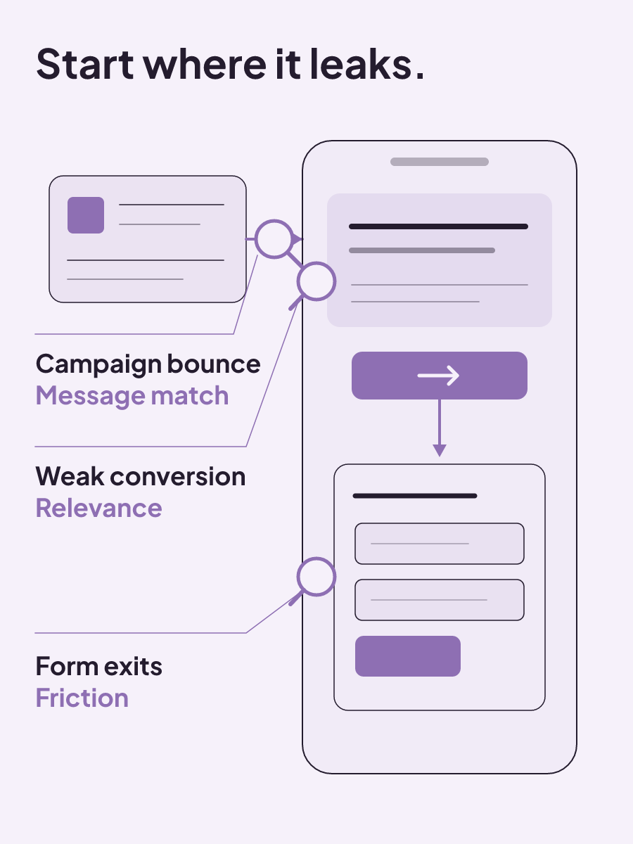
- The page gets traffic but conversion is weak: test relevance first. Compare the incoming intent with the headline, first-screen details, and defined action.
- Visitors click the call to action but abandon the form: test form friction. Look at how easy the form is to find, how many fields it presents, and whether the requested action still feels clear.
- Bounce is high for one campaign: check message match before redesigning the whole page. Compare that campaign's promise with the first screen visitors receive.
When you begin testing, work on major elements before small refinements. The headline, hero layout, primary call to action, form friction, and proof placement can change the visitor's decision path. Minor visual edits are a poor first response when the page is answering the wrong intent or the form is where people stop.
Keep the diagnosis tied to the relevant part of the path. Weak conversion with traffic does not automatically prove the button is the problem. A clicked button followed by abandonment gives you a more specific place to investigate. Campaign-specific bounce points back toward the connection between that campaign and its landing page.
This approach also gives your test a clear question. You are not asking whether a new design looks better. You are asking whether a change repairs the observed break. Once that break is clear, you can choose the major element that deserves the first test and leave unrelated parts of the page alone.
When the lead form sits inside the ad
In Search and Performance Max campaigns, Google Ads lead forms let people submit information inside the ad without leaving the page.
Google also supports adding lead form assets to Search and Performance Max campaigns. The visible website page is removed from that version of the path, but the operational questions remain. The form still needs a defined action. The submission still needs a clear next state, and the captured information still needs to support the intended handoff.
Measurement also needs an explicit setup. For website conversion tracking, the Google tag works with an event snippet or phone snippet. Those are the named tracking components, not a general assurance that every click or form interaction is already measured.
Review in-ad forms as their own path. Do not assume the tracking or thank-you experience from a website form carries over. Identify the intended action, inspect the post-submit state available in the ad, and confirm that the campaign's measurement records the conversion you mean to count.
What counts as a good conversion rate?
There is no single useful benchmark for every landing page. Conversion expectations vary by industry, business model, channel, and target audience. A number from a different market or traffic source may describe a very different decision.
Specificity adds another tradeoff. A more specific ad can attract fewer clicks and therefore produce a lower click-through rate, while producing a higher conversion rate. The right balance depends on the campaign goal. A campaign built for broad attention and one built for completed lead forms should not be judged by one metric in isolation.
Define the intended conversion first, then compare the rate within the campaign's actual context. Use the first broken continuity check as the testing target. That keeps attention on the connection between the campaign promise, form, thank-you state, and conversion tracking instead of a universal benchmark.
If the break sits between a submitted request and a scheduled conversation, see how patient booking systems connect booking and follow-up. Start with the first handoff your current path cannot carry cleanly, and fix that connection before adding another page element.
How to choose a local SEO company that can show its work
A local SEO company is worth hiring when it names the work, measures business actions, prices the scope clearly, and avoids ranking guarantees.
Read insight
Local SEO price guide for med spas: what should your package include?
Local SEO prices usually run $500 to $2,500+ monthly, but a fair quote depends on the work, reporting, and internal execution it requires.
Read insight
Local SEO listing guide: what to fix, maintain, and pay for
Local SEO listing management starts with accurate records, duplicate cleanup, documented corrections, quarterly audits, and full per-location costs.
Read insight